Get your business noticed!
Of all the marketing channels that a business may use, the good old pop-up is probably the best in value for money as you can position it right in front of your target audience at a conference, talk, expo or exhibition. Or they could easily fill in a dull corner in your business foyer or office making the environment look more dynamic writes Jim Masson.
Modern materials make the PVC banner a durable item with an anti-scuff surface and it can be used over a number of years before it needs refreshed with a mark two version. They are relatively low cost and should not be a major budgetary concern unless you are really on a shoestring. Pop-ups can range from £30-100 (depending on size and quality including the artwork required).
Less is more – too much small detail is lost if you try and cram too much onto a pop-up. Consider this idea of how we use social space drawing on social psychology ideas: 0-3 feet is our intimate, personal space; we then move into the pop-up arena where 3-9 feet is our informal space eg out for a coffee with friends; at 9 feet+ that is the formal space we interact in eg at an interview for a job. We are really concerned about the latter two categories and most will be attracted to the pop-up at 9 feet distance, and if it is much further than this, then the detail will need to be scaled down if you wish to target your audience and communicate your message. Basically, you may need a pop up for either social communication space, or a really well designed one which can double up.
Eye catching colours are good …. but, too much colour can confuse the eye. Consider, the eye automatically assimilates information from left to right eg that’s how we read and your brain is programmed to do this from a early age. Therefore, colour can be used to help the eye to navigate to the right parts of the pop-up that carry your key message.
Dark colours such as black have a sober tone while navy blue has resonations of low mood and possible people who suffer from depression may be subliminally drawn to it. Ice blue according to the tenets of car manufacturers and marketing gurus is a colour associated with success and drive. So colour choice is important. There is no space here to elaborate on this but the point being that we react to colours cognitively and emotionally and using bright colours attracts the eye, and stimulates interest.
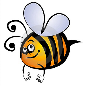
Consider too using contrasting colours that are adjacent eg black and yellow, the bumblebee colours, are best visible at a distance. Too many dark colour would not only look low key but in are area of poor light would not stand out, so using image and graphics that are high key can be quite effective.
Ensure that your photographer takes high resolution images if you are designing from scratch. This gives the graphic designer something to work from and not having to worry about grainy low resolution images.
Note, if you are supplying images to the banner designer, ensure that the resolution is set at 300 dpi as this will ensure a good quality print when the screen is run off. But this can only be done if they are captured in suitable high res initially. Hire a good photographer who knows what s/he is doing.
The carrying case for the roller banner is a god-send as it is so easy to literally pop-up the banner yourself, quickly if needed. The vertical par at the back of the pop-up keeps the screen up once it’s secured. This makes carrying the pop-up safer and easy to handle. And do put a sticker on it with the name of your company and phone number in case it accidentally goes walkies.
Now, a word of caution. When you design your pop-up, if you intend to use it for background at the photo shoot, ensure that your company name and logo, web address, vision/mission statement is located near the top as the eye will work through this information prioritising it from top down, but just above head height. Otherwise a photographer may take a great photo but only to have the top part of the image cropped out when the sub-editor of a newspaper or magazine edit’s the image and the whole purpose of the pop-up is undermined – ie we end up with a headless pop up and an insipid press photo.
The pop-up can also be positioned at the side to help frame the subjects in the group. And even better, why not use two pop-ups to create a structural balance, book-ending the small group smiling to the camera?
Once you have got all of this under your belt, you will then need to work out what size of pop-up you need. Mostly, a 6-8 feet banner would be sufficient. But this size gives you a small counter/desktop pop-up for visual impact, and for large areas such as at exhibitions, you could get one much larger and wide eg 10-feet x4-feet.
Make sure your banner is visible and not obscured by tables, seats and other items and even, dare I say it, other pop-up banners.
The pop-up is but one of the many promotional tools in your marketing mix and can be used on its own or with other posters, logo-ised assistants with t-shirts on and a host of other marketing ploys such as logo-ised pens, balloons and giveaways.
And like any strategy in your business, you can monitor and evaluate the performance of the pop up, even do split A/B testing with it if you wish, making another pop-up with an alternative design option.
Now, I’m going to make a confession… I don’t have a pop up! But I will very soon following my conversion on the road to Damascus.
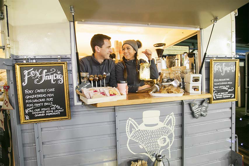
My experience in dealing with pop ups comes from working as a press photographer for 20 years. I have many good and not-so-good experiences over the years with pop ups whilst going about my business taking photographs of everything from sports’ awards, local council and agency presentations; and charity, community and business events. Pop-up design can be enhanced with a quality photograph or infographic. Creativity knows no bounds.
I have seen people struggle to get them erected, I’ve seen them collapse, blown away, fall over, and simply fail to get the message across when badly designed. A well-designed pop up is worth its weight in gold.
Lastly, spell check everything that is ‘written’ for your pop-up. A stitch in time saves nine, and possibly a costly embarrassment.
Why not try and design your own pop-up using the criteria discussed above? And then consult a LOCAL printer who will further advise on design.
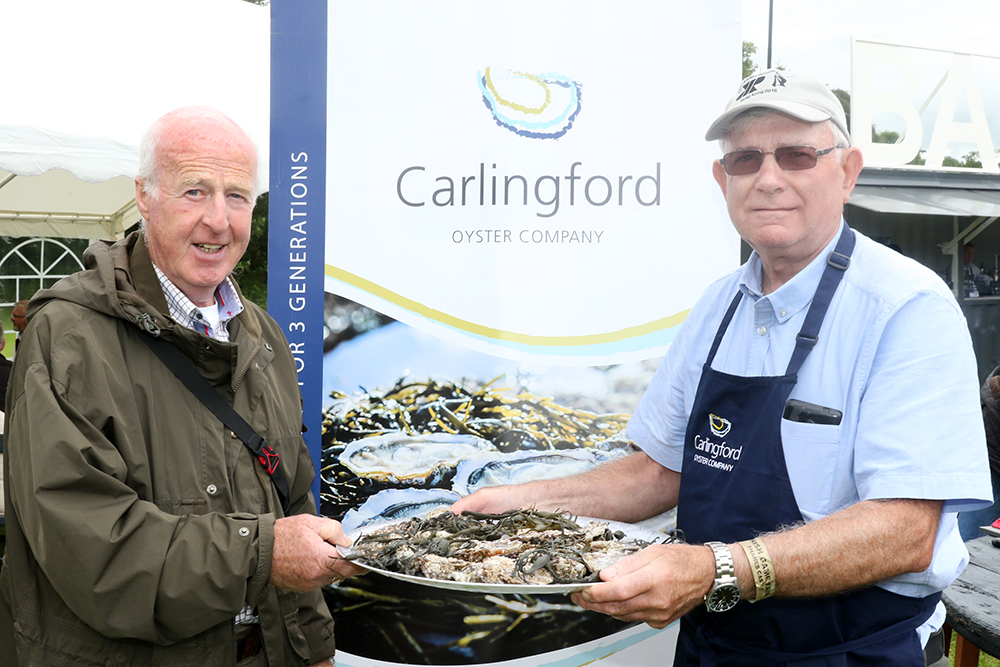
The world is your oyster, the world is your pop-up!
#shoplocal


